American lighting
Art direction, brand guidelines, logo design, print design, web design, trade show graphics

American Lighting embraced a refreshed identity that highlighted its values, strengthened its brand voice, and elevated the customer experience.


From catalog to cohesive brand
The updated brand book defined the new American Lighting, integrating story and design into a clear identity that guided brochures, marketing materials, and the website refresh. My work gave internal teams a shared framework to collaborate more effectively and helped the company transition into a more cohesive, contemporary identity.

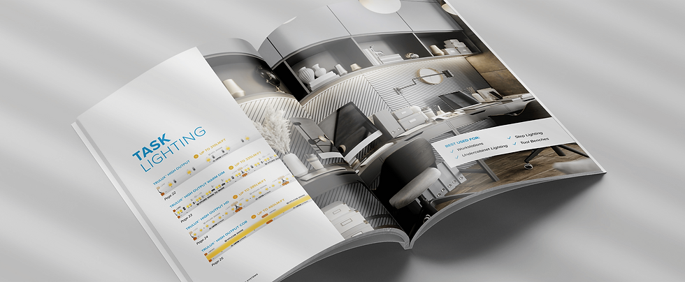
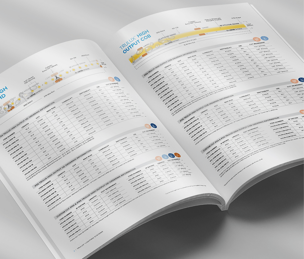
Product support brochure: the Trulux Supplement
Developed as comprehensive marketing collateral, the Trulux Supplement served contractors, designers, and sales teams. I designed the brochure to break complex tape light systems into clear, illustrated sections with step-by-step instructions and practical tips, turning technical details into accessible product knowledge and effective sales support.


Brochures for product launches
The product brochures introduced new releases and highlighted key features, benefits, and applications. Designed as sales support tools, they included pieces I created myself as well as others I directed, that gave clear, consistent collateral for presenting products and helping customers compare options with confidence.


From catalog to eCommerce
For American Lighting, this was a company-wide effort—Operations, Sales, Marketing, and Creative working together to transform a catalog-style site into a full eCommerce platform. With intuitive search, product comparison, and newly introduced purchasing, the site created a smooth customer journey. Guided by the brand book, my team delivered a refreshed design while I made certain the look and feel matched the company’s values.


Part 2: defining what's next
After several years, the visual language was revisited and refined to present the brand with a more polished and elevated tone — one that better matched the expectations of its high-end reps. Adjustments in color, typography, and application photography gave the materials a cleaner, more contemporary presence.

Brand book update
I updated the American Lighting brand book to capture the company’s new look, defining a visual identity system that could adapt to different audiences. It standardized new typography, colors, photography, and design treatments so brochures, catalogs, and collateral all spoke with one, new voice. The updated brand book became the foundation for every new marketing piece, creating consistency while supporting a more design-forward presence.


Showroom lookbook
The Lookbook was one of the first applications of American Lighting’s refreshed identity, influenced by the visual direction I established. Created as marketing collateral for showroom reps and customers, it used refined photography and clean layouts to tell a design-forward story of how lighting integrates into everyday life. More than technical specs, it gave teams a narrative-driven sales tool and customers an elevated way to see lighting in their homes and projects.


New product brochures
I created some product brochures that applied American Lighting’s refreshed identity in a flexible way across different audiences and product lines. Each piece balanced technical details with clean design, giving sales reps consistent tools while helping customers compare options with clarity.
